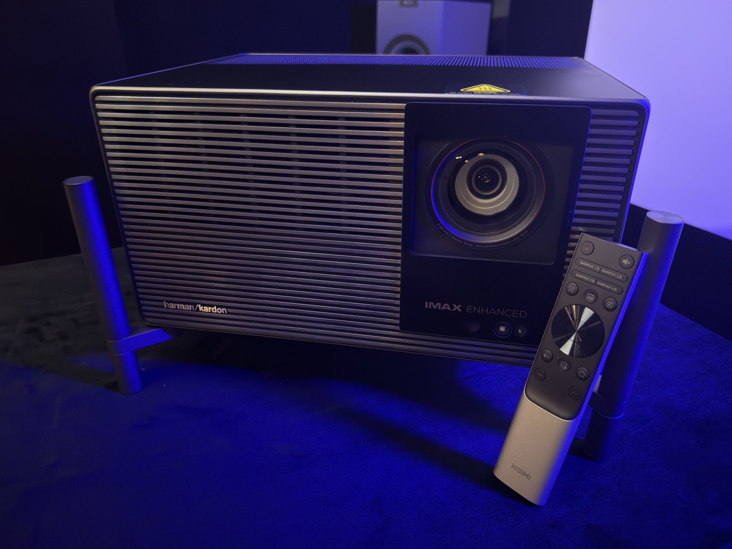
This is a quick and dirty rundown of my experience with the XGIMI Titan Noir Max over a few hours of use. I quickly got this written up so people have it early in the Kickstarter campaign. My opinions will most certainly change over time as I spend more time with it.
I mainly used Movie Picture mode, Movie color temp, DBLE on, iris set to Dynamic, but I’ll note some things where I didn’t. I set MEMC to weak just to not run in to judder since the 24p update is in progress. I don’t really see RBE and left anti-RBE off. It is unusable turned on due to dithering. It is throwing a 120″ image on my Seymour Glacier White screen. OK, here’s my thoughts…
Contrast
- Intra-scene contrast is honestly fantastic. Anything that isn’t a true dark scene really looks great. There’s a scene from Lucy where Morgan freeman is giving a talk in front of a white screen, it also cuts to people in the auditorium with varied skin tones. This scene looked crazy good IMO. The white screen behind Morgan Freeman didn’t wash him out at all. The depth to the people in the crowd was great. Highly detailed too.
- Dark scene contrast can be quite good. When I watched the TNM by itself I was pretty impressed with dark scenes. Bright objects really popped on dark backgrounds which helped perceptually with the blacks.
- I noticed some brightness jumps as the scenes changed in highlight brightness. I also noticed clipping here and there with the worst of it happening in the Oblivion scene where Jack (Tom Cruise) is captured and tied up. When it cuts from the dark Morgan Freeman to Tom, Tom’s face is blown out and then adjusts back down. It does this every time between the cuts. Also, the first time it cuts to Morgan Freeman, he’s lighting a cigar and the flame keeps the black level raised. Then the next time it cuts back to him you see the black level drop significantly. The lack of continuity here can be a bit distracting based on your tolerance level for artifacts like these.
- When there aren’t issues like the above, dark scenes are surprisingly good for how damn bright the projector is.
Brightness
- Holy moly, this thing is bright. Perceptually it is twice as bright as the NZ500 in Dynamic iris mode. Made me squint multiple times with some bright content. Is it too bright? Maybe for me in this setup. I think I might prefer a dynamic iris mode that is shifted lower where it hits between f5.5 and f7.0.
- I did some very rough measurements off the screen to see what I was getting and it was 370 nits in f2.0, 260 in f4.0, 170 in f5.5, and 85 in f7.0. I forgot what f3.0 was. Definitely need that f6.0 that splits the 85 and 170 nits. On my screen with my bat cave I’d personally like ~140 nits with better blacks in dark scenes. Maybe….the brightness on some stuff is intoxicating with the color.
Color
- Ok, triple lasers are colorful. We know this. But damn, when you have 260 nits in dynamic mode with this color it is incredible. I use a scene from Inside Out where Joy and Sadness go searching for Bing Bong. This is one of the rare movies with a good amount of color beyond P3. The scene also has some dark parts with great color saturation. I didn’t know this scene was supposed to look like this. That was my first thought. I showed the scene to my 12 year old daughter and 20 seconds in she said “I don’t remember this movie looking like this” followed by “I now want to rewatch this on this projector.” My daughter is usually unimpressed by the projectors I bring in to our theater. She says the NZ500 is always best and doesn’t pay much attention to the new toys. This time is different. So yeah…
- I also threw on a scene from Spider-Man: Into the Spiderverse – again a beyond P3 film. This is where they are escaping with the computer they’re trying to steal. This wasn’t as impactful as Inside Out but it was incredibly bright and the color saturation on the Spidermen were impactful.
- I’ve thought that bright triple laser DLPs are good for animated content for awhile but I honestly think the TNM took this up a level or two.
Tidbits
- It’s not really a finicky projector. I didn’t find myself changing settings a lot once I set it up for each mode/content type. I didn’t even really play with the artificial enhancers like Super Resolution or Dynamic Contrast. Maybe those make it better? Dunno, I was happy with the image most of the time and didn’t go for the remote other than to change iris settings to see what level I liked/how each performed.
- The overall polish on this projector is great. Menus, other than truncated text, are logically laid out and look good. The remote feels good in hand. The feet are so easy to spin and use. The lens shift menu on screen is snazzy and intuitive. Its just a nice projector to use. As a UX designer by trade I really appreciate this. Put a smile on my face a couple of times.
Versus the NZ500
This was interesting. To be honest, I was a little nerves going into it. Not because I’m afraid of something beating the NZ500 but because I don’t want to have to change my screen again. Overall, the TNM is so much brighter and delivers acceptable to very good dark scenes. It has greater than measured perceived dynamic range due to its brightness and intra-scene contrast (Ironically both can be measured). I can for sure see people preferring it over the NZ500 due to the brightness you get and the immense color due to that brightness and large gamut. There’s a slight sacrifice in dark scenes due to the dynamic contrast algorithm and the lack of native but when DBLE is doing its thing I don’t think anyone would ever groan at it which is typically the case for bright DLPs. Ok, some detailed notes:
- Makes my NZ500 look like a freaking candle. I felt like it was perceptually twice as bright. It is about 110 nits brighter (150 vs 260) in the modes I was using. Some of the additional perceived brightness could be due to tone mapping and/or the high ADL contrast difference. Either way, if you are a brightness fiend this’ll do it.
- Overall, tone mapping was comparable in the clips I was looking at. At least in terms of detail preservation. For the JVC to have a shot at keeping up in brightness I needed to use Auto Wide. That can result in a bit of a flatter image on the JVC at times….which was not the case on the TNM. It really never looked flat. I also appreciated the screen and gain controls on the TNM that lets you fine tune the tone mapping.
- Having the JVC next to the TNM really highlighted the DBLE artifacts. The NZ500’s best strength is it is never offensive. Dark scenes just look good without tricks. Bright scenes aren’t washed out. Color isn’t amazing, but on its own it looks good and doesn’t draw attention to itself. You can just watch the movie and not have to look past the projector. The TNM is not quite that. The brightness shifts between cuts in dark scenes are visible. The gamma manipulation can be visible. And then there’s the speckle you need to look past or eliminate in other ways.
- Color is not even close. The brightness and saturation make the TNM smack you in the face with the rainbow. On blue, the NZ500 is right there, it just isn’t as bright. The TNM made my NZ500 look like a slightly rotten orange on red saturation test.
I think it really comes down to a few of things with these two: brightness, color, and artifacts. Yes, I didn’t say contrast. I think the TNM is good on contrast and black level if you can look past the dimming artifacts and/or XGIMI fine tunes the algorithm. Nexigo managed to beat it in artifacts in some areas so I know it’s possible.
Downsides
- Speckle. There’s quite a bit of it on my screen and I’d probably consider it quite problematic. Not really surprising but worth calling out. I’ve switched to a solid screen and dual centers. Going to a woven screen would mean I’d lose 30% of it’s output. That takes the 260 nits to 180 nits. My JVC does 150 nits. That’s some interesting calculus. For this reason I’d like to see a Dynamic Bright mode that goes from f2.0 down to something like f4.0 or f5.5. That would mean 360 nits is now 260….ok.
- Dynamic Black Level Enhancement, DBLE, is slow at times and too visible
- There is a patterned static dithering noise even with Anti-RBE off
- Anti-RBE adds too much noise for me
- Transitions from scene to scene can show horizontal flickering lines, especially bright transitions
- The menus, while they look good, are truncated way too much in English and end up scrolling. I really encourage XGIMI to make the menu more friendly for longer languages so there’s less scrolling text.
- Light spill. You can hold up a white piece of paper to the lens and see a big ol’ ring around the projected image. It’s worse shining to the top right if shelf mounted.
- I couldn’t shift the image until after initial image. Minor nit pick but kinda annoying.
- Banding and color shifts in gradients
Is it worth the Kickstarter asking price? Absolutely. I think it’s worth more than that, too.
Leave a Reply